The Hillside Tavern & Grill
Traditional and cozy vibes for Wisconsin supper club logo design
Wisconsin supper club restaurant rebrand
Client
The Hillside Tavern & Grill
Industry
Restaurant
Location
Sayner, Wisconsin
Project Scope
Logo Design
Branding
Website

The Hillside frog – from sketch to design
The branding process was a unique collaboration between the client and designer. The first part of the process was determining how to rebrand the Tavern. Given the considerations of the location, new management, and ideal business goals – it was decided to simplify the name to “Hillside Tavern & Grill” (removing Vinchi’s). This small change would mean minimal disruption and help maintain brand loyalty for the establishment, a critical factor for the new owners.
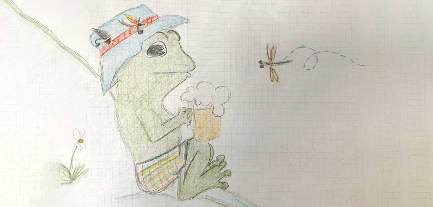
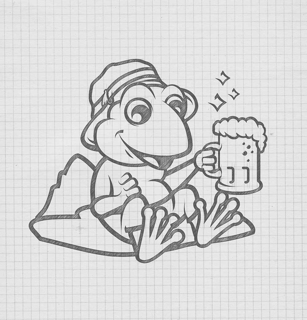
Upon start of the process, the new restaurant owners provided an original sketch of their logo idea. The drawing was a cartoon-based frog in fisherman gear, laid back enjoying a refreshing beer. This sketch provided the direction for the new logo – a concept that would be friendly and welcoming, just like the restaurant.
Original sketch provided by the client:
After these initial details, RYCO Design conducted additional research, including local restaurant logo designs, animated cartoon logos and specifically, logos with frogs. With the frog intended to be the brand moniker, Ryan had to determine the distinct look for the restaurant’s character. Frog animations range from colorful to abstract designs, including prominent water details to accessories like sunglasses and fishing poles or taking on human-like personalities and body features. With these options in mind, Ryan knew to design a restaurant logo that would appear modern, welcoming, but not too playful.
With the original sketch and a collection of frog inspiration, we pulled several digital designs for the frog. Two final designs were provided that showcased a fisher frog with a smile and a beer. The client selected their preference, pleased with the process from logo sketch to design.

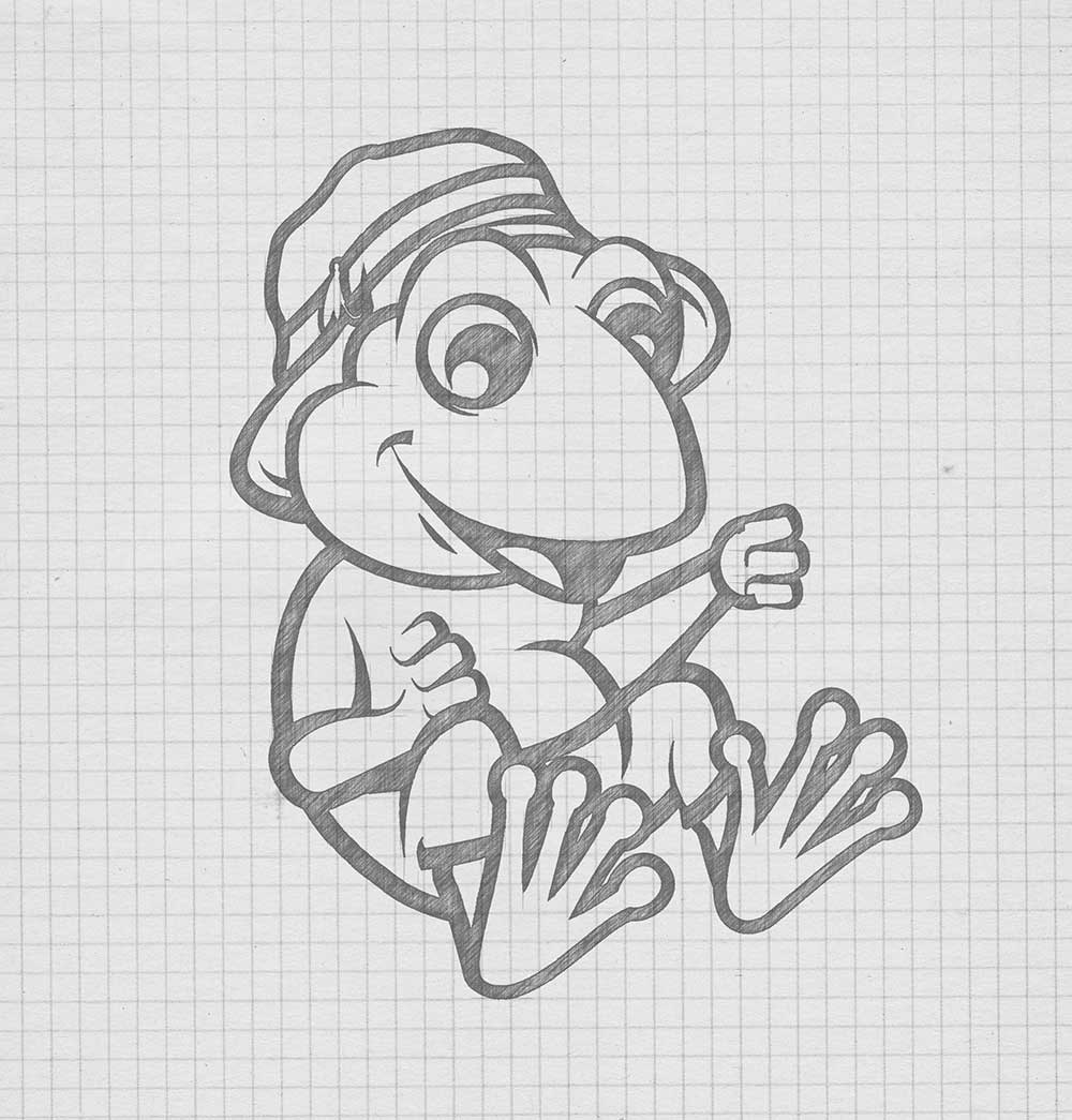
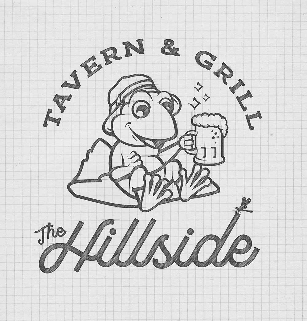
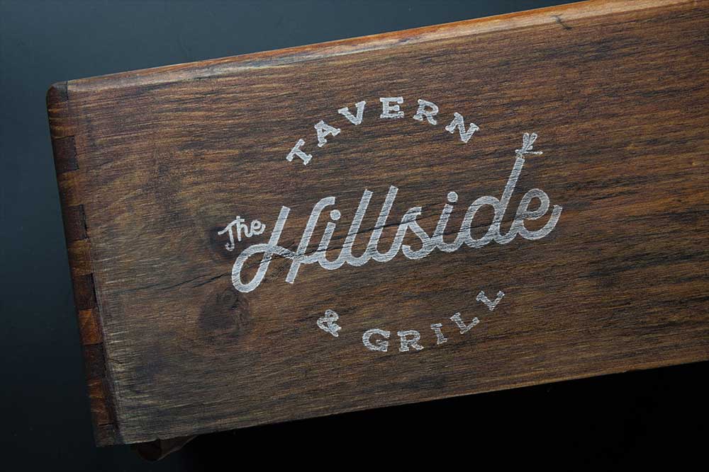
After finalizing the frog design, we began adding the restaurant logo refinements – including color palette, illustration, and font type. The color palette chosen were cool colors that played well off the details of the animation. The final logo typeface includes a combination of serif and italic fonts. The full restaurant name is drawn out around the frog animation – where “The Hillside” stands out as a primary header to the illustration.

Traditional supper club achieves animated brand
The final logo was a distinct match for the traditional, cozy, supper club style restaurant. The final logo showcases a laid-back frog with welcoming design features – a signature restaurant brand, matching its one-of-a-kind reputation.
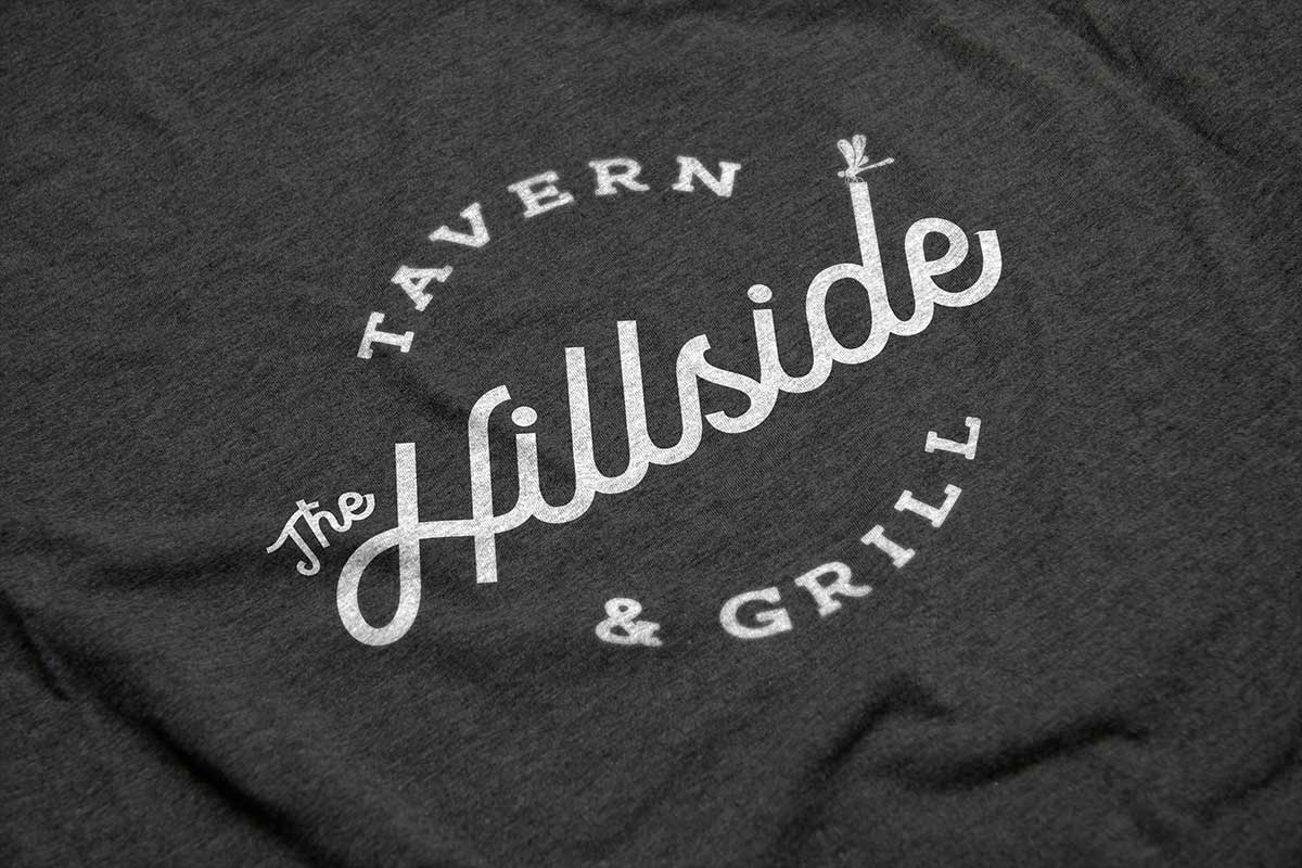
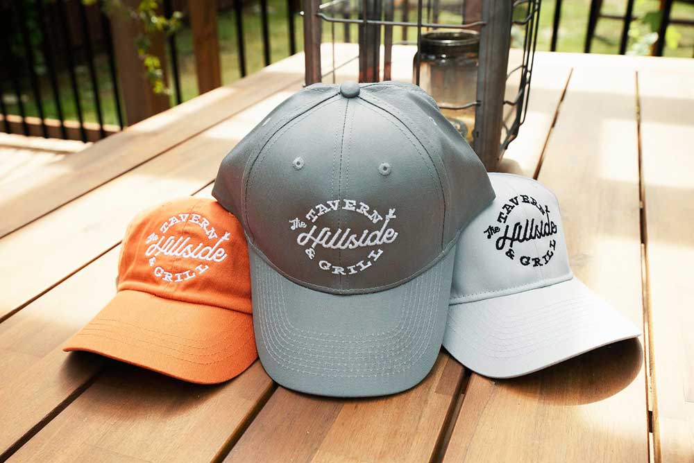
In addition to the primary logo, RYCO also developed several variations of the logo, so that it can be used on different mediums. The client was provided with logo options – frog icon only, frog and text, text only and badge style logos. With these alternative design options, the client can use their new restaurant logo on future materials like aprons, shirts, cups, coasters, signage and other merchandise.
RYCO Design was able to take an established community favorite and give it more life, through a logo rebrand, while meeting the expectations of the clients and the community.
