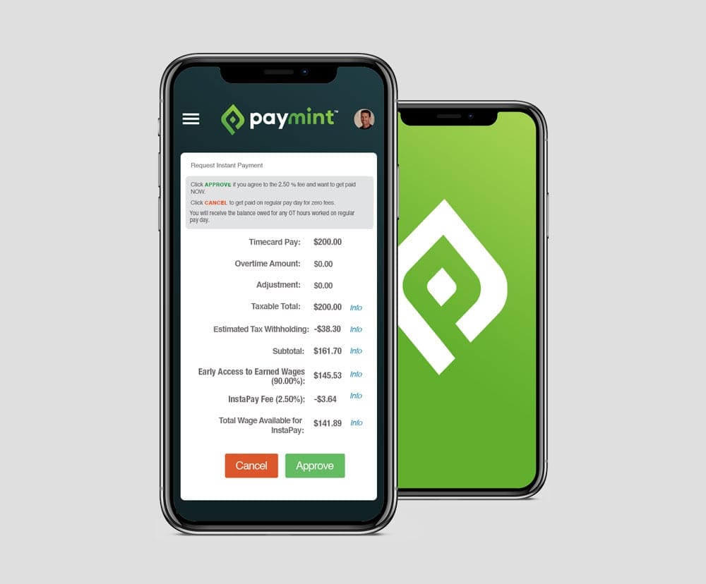
Paymint
The Ridiculously Easy Way to Pay Your Workforce Daily
The Project
Daily Digital Payment Software Entices Employers and Employees
Paymint is a fully automated software application that allows for employers to pay workers instantly at the end of their shift rather than at the end of a full pay cycle. The application features a front-end system with electronic timecard approval for individual or bulk approvals. With a small fee charged to the worker, this unique digital payment option allows workers to be paid daily, creating a retention incentive benefiting employers and making life easier for contract and part-time employees.

The Journey
Developing a Brand for Employee Money Distribution
Paymint originated from a booking, recruitment and credentialing company. After getting more customer interest in the daily payment software, the team decided to create a separate entity and new brand for this part of the business. The new product also included new interfaces for travel nurses, truckers, and emergency check runs.
With entry into the SaaS market for mainstream employers and tech-savvy employees, Paymint wanted to develop a modern brand that reflects a trustworthy company for paychecks on behalf of employers.
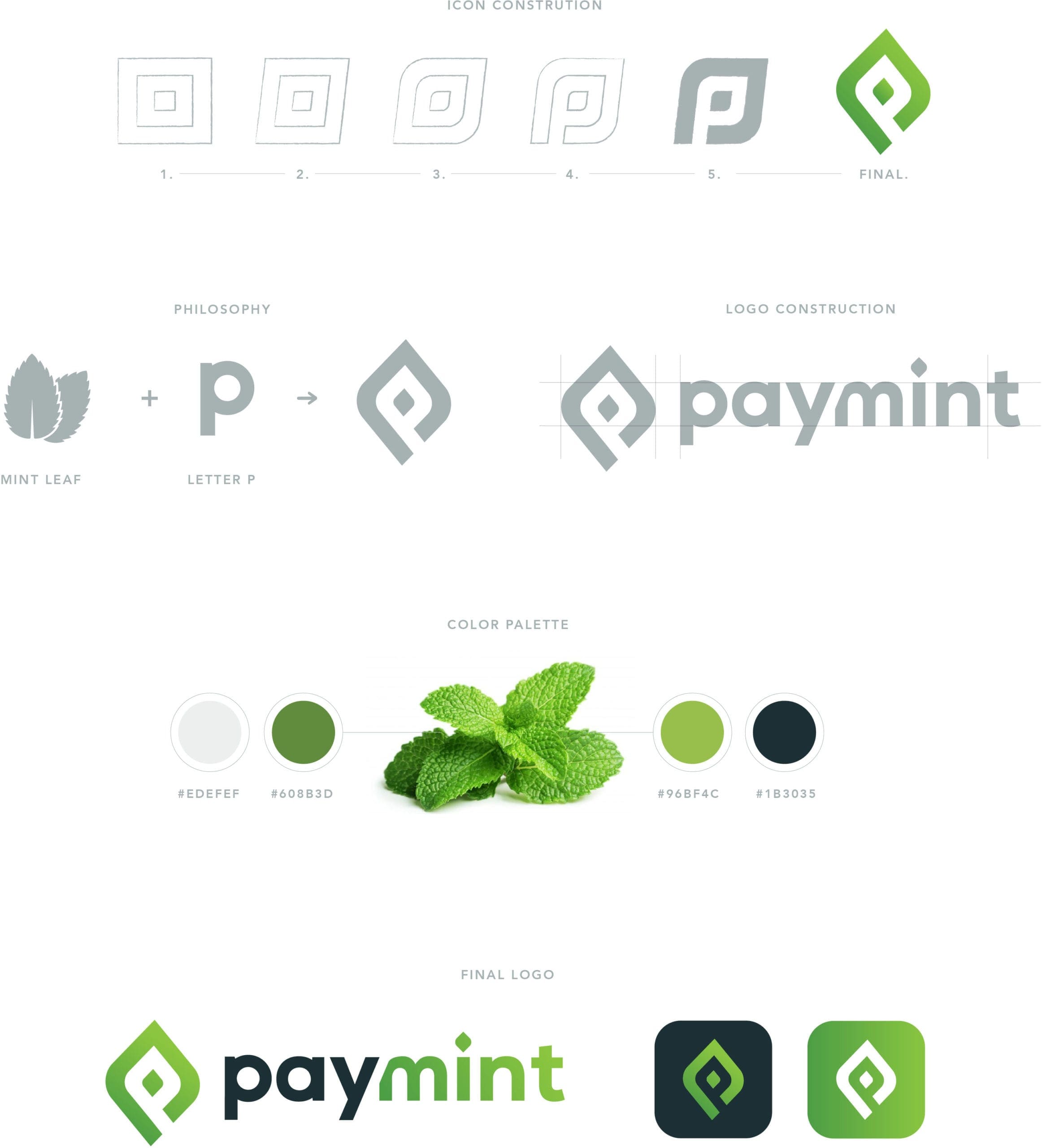
Initial Logo Design Concepts

Logo Design Process
The Need
Emphasizing Wordplay into a Sophisticated Logo Design
The team began work immediately. The new company was targeting mid-range employers who has contract employees who wanted to get their money quickly, through the advantage of technology. The key goal here would be to conceptually show users the “green.”
RYCO Design consider the company’s wordplay on “payment” – pay being a straightforward description of the business model and the mint exuding “money” in a modern way – and used this as inspiration for the new logo design. RYCO Design began with 4-5 logo sketches as options to the client. These initial designs featured the letter “P” in a digitized way or conveying motion, and the mint leaf was sketched in various abstract forms. After reviewing the options, the client was most interested in using a combination of the initial and the mint image.
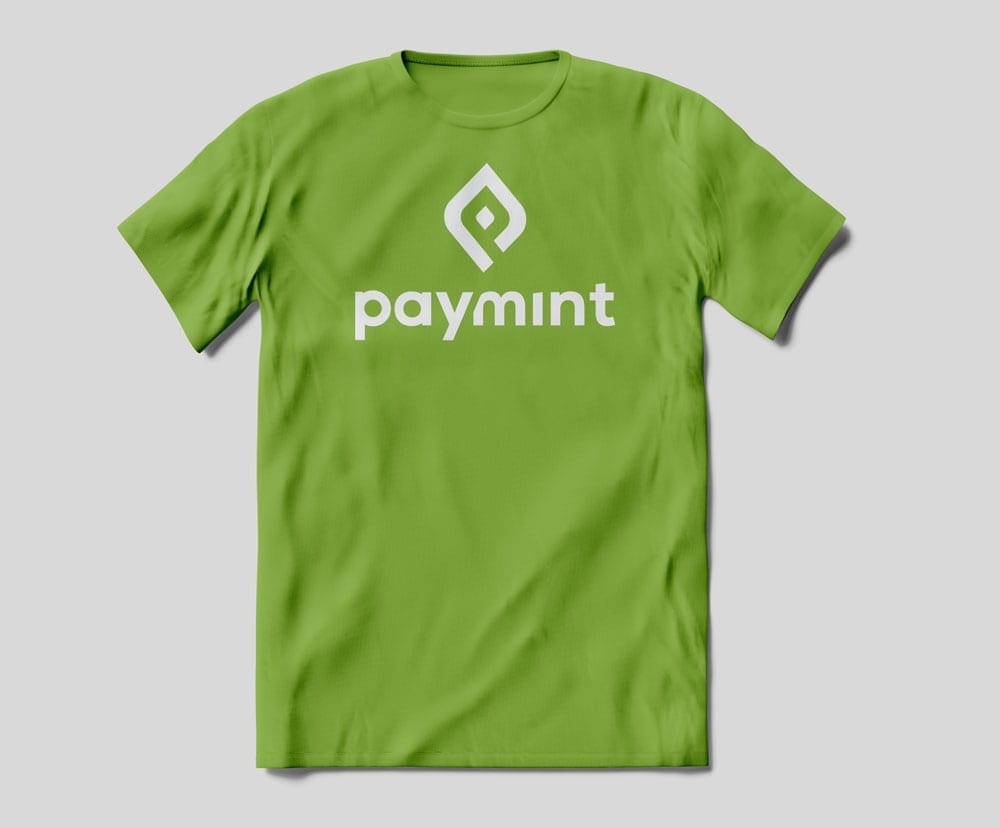
Within just a few weeks, RYCO Design used this logo philosophy and the client feedback to create the final version. The final Paymint logo features the mint leaf shape as an abstract icon that could be a digital symbol and embedded is the letter P at an angle, which conveys the movement of money. The full logo has modern sans serif lettering in mint green colors, rightly so, along with navy and gray hues to complement. The icon is modern, fresh and straightforward so it can stand alone to represent the Paymint brand.
The Result
New Brand Design Shows Users the Green in Digital and Live Environments
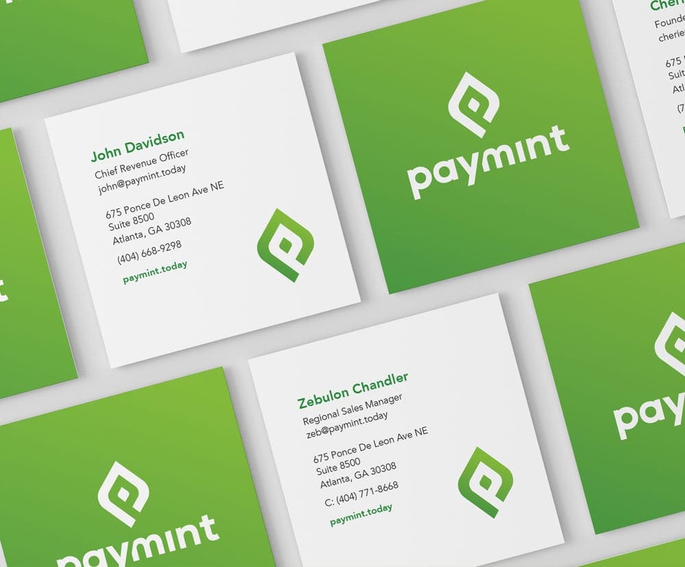
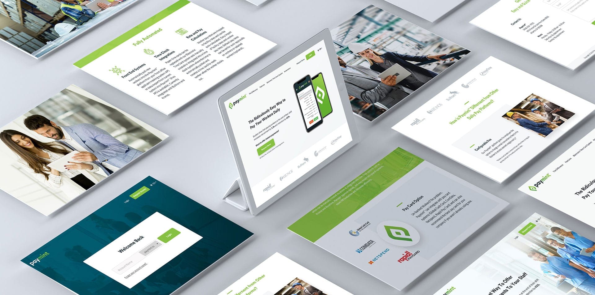
The logo design was the first step in branding this software company. Once the branding philosophy was confirmed and had an anchor design, the team tackled other collateral pieces. Next, the website design needed to reflect a fresh, modern, technology-forward company. RYCO Design created an initial layout using the new color palette and variations of the logo and icon, which was passed on to the developer, who created the final, public facing website utilizing Webflows.
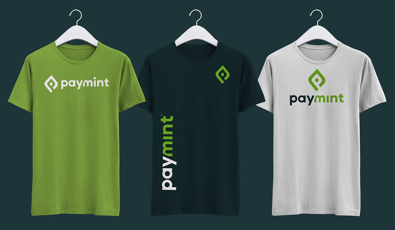
Afterwards, RYCO Design helped Paymint prepare to take this new brand to a live audience at an upcoming trade show. Their event presence included new, branded t-shirts, a booth design, banner stands and print collateral. The response during the conference was phenomenal, they got a lot of traction at the booth and several inquiries about implementing the software across various industries. The Paymint team has since used RYCO Design for additional collateral requests, so that employees everywhere can see the green.
