Coldwell Co.
Visualizing the strength and grit of excavation services
Excavation branding in Kearsarge Region
For more than a decade, Coldwell Co. has served residential industries across the Kearsarge region with exceptional quality excavation services. The most common jobs for the company included excavation, logging, landscaping and concrete services.
Working as a small operation, the company was known for providing a personal and flexible services with a fast turnaround. But to potential customers, all they knew of Coldwell Co. was their generic logo.
The original Coldwell logo was a colorless square block with generic illustrations of machinery at the top, followed by the company name in traditional serif font and the last row listed the name of the city and phone number. The logo was elementary in design, crowded with information and the many elements in the square block made the logo inflexible to use.
After years of delivering exceptional quality to their neighbors in Sutton, New Hampshire, the company sought a rebrand to better present not only their high-quality service, but their tough, credible and polished reputation to excavation customers across the broader Kearsarge region.
Client / Coldwell Co.
Industry / Excavation
Location / Sutton, New Hampshire
Project Scope
Digging the foundation on a new brand
The company requested a unique logo, but gave the firm latitude on design specifications. RYCO Design conducted market research to understand the full scope of the company services and zero in on what would be most appealing to their audience.
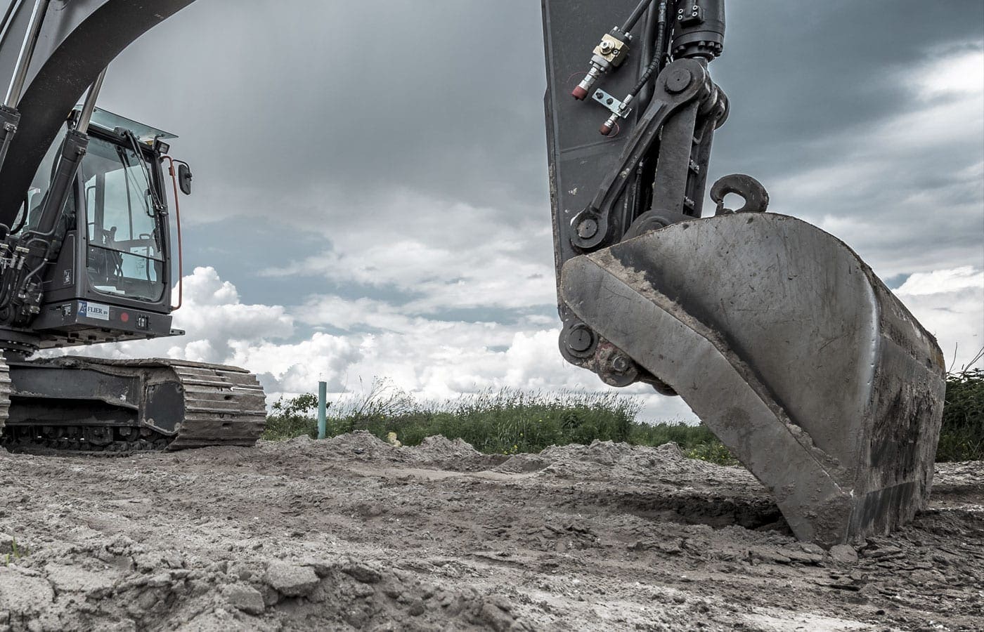
Excavation contractors play a vital role in any construction project, to ultimately control the foundation of a project. The excavation branding process began with considering the role of project managers and how they select a construction company. The project work involves using heavy machinery, construction, soil and land, so RYCO focused on creating a new logo that encompassed the colors and the features of the company’s gritty line of work.
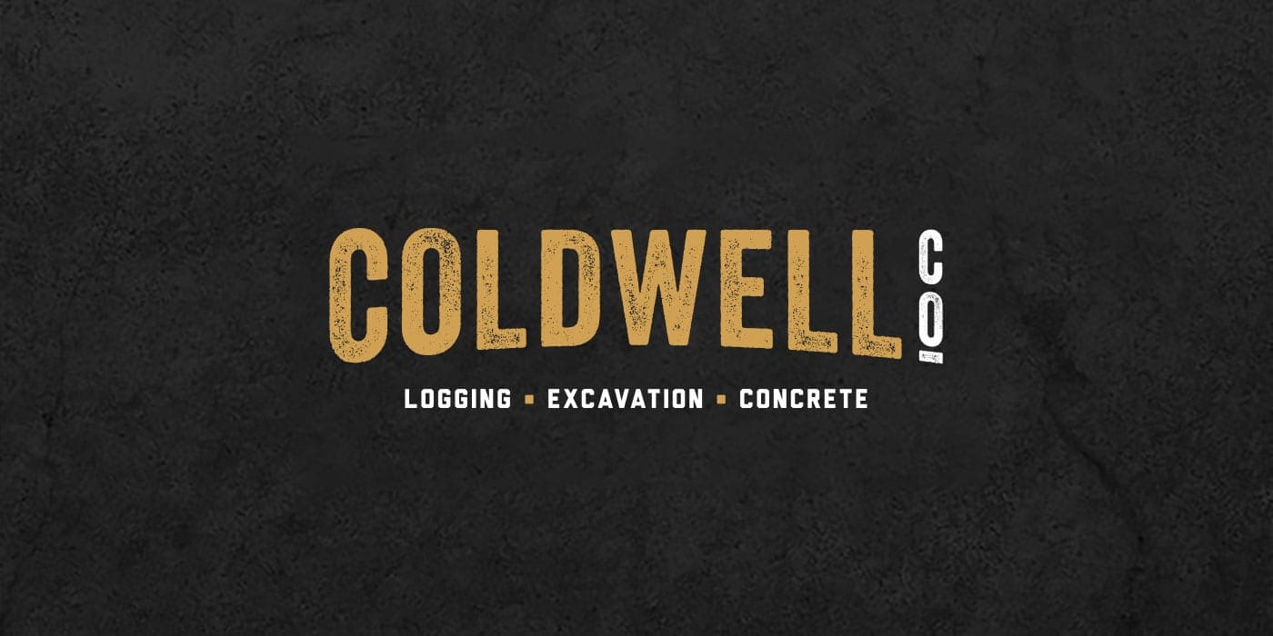
RYCO immediately knew they would follow a minimalist design. Specifically, a wordmark logo, a unique text-only typographic treatment to make the business name identifiable as a brand identity. RYCO spent substantial time researching typography options that would work for the construction industry.
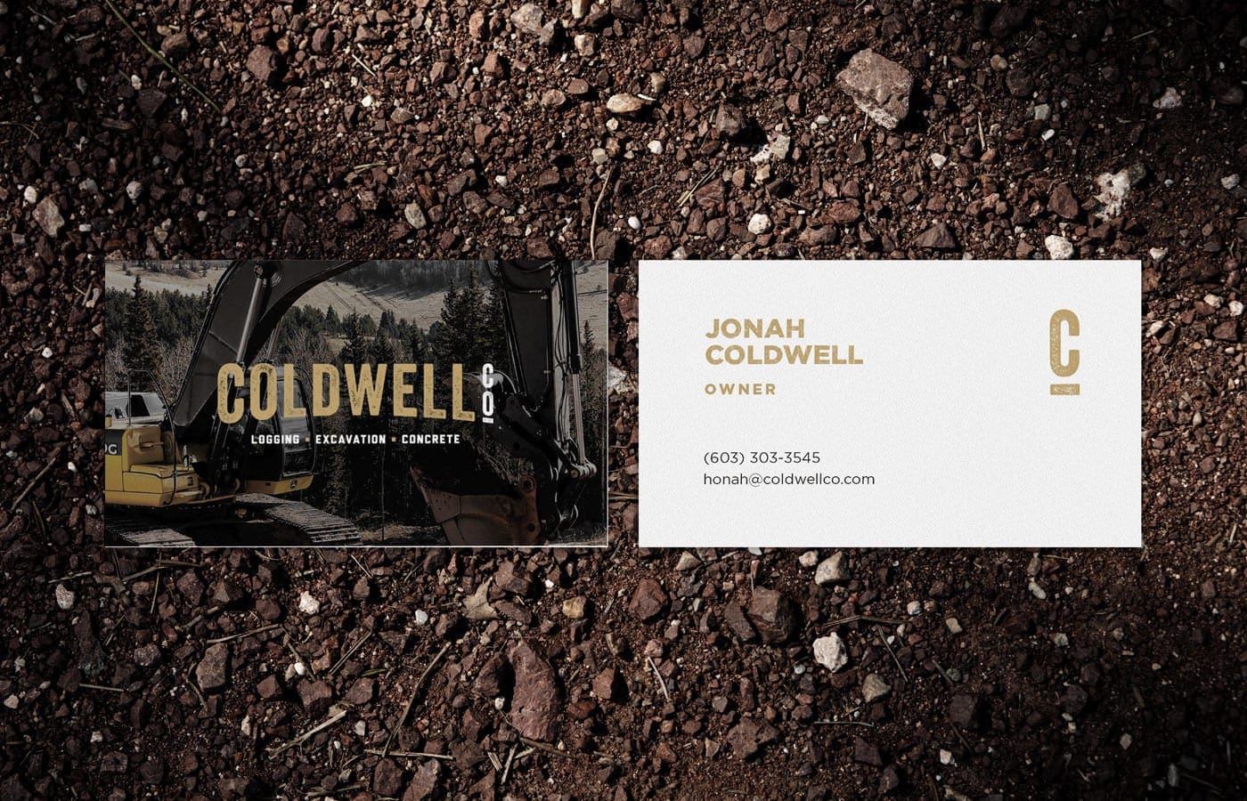

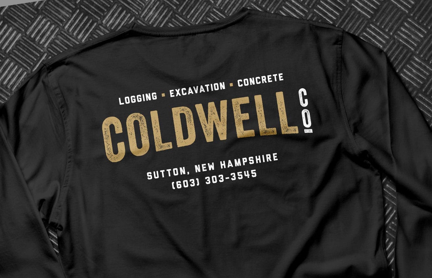
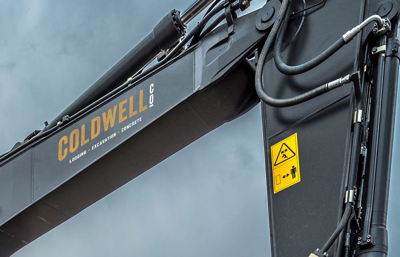
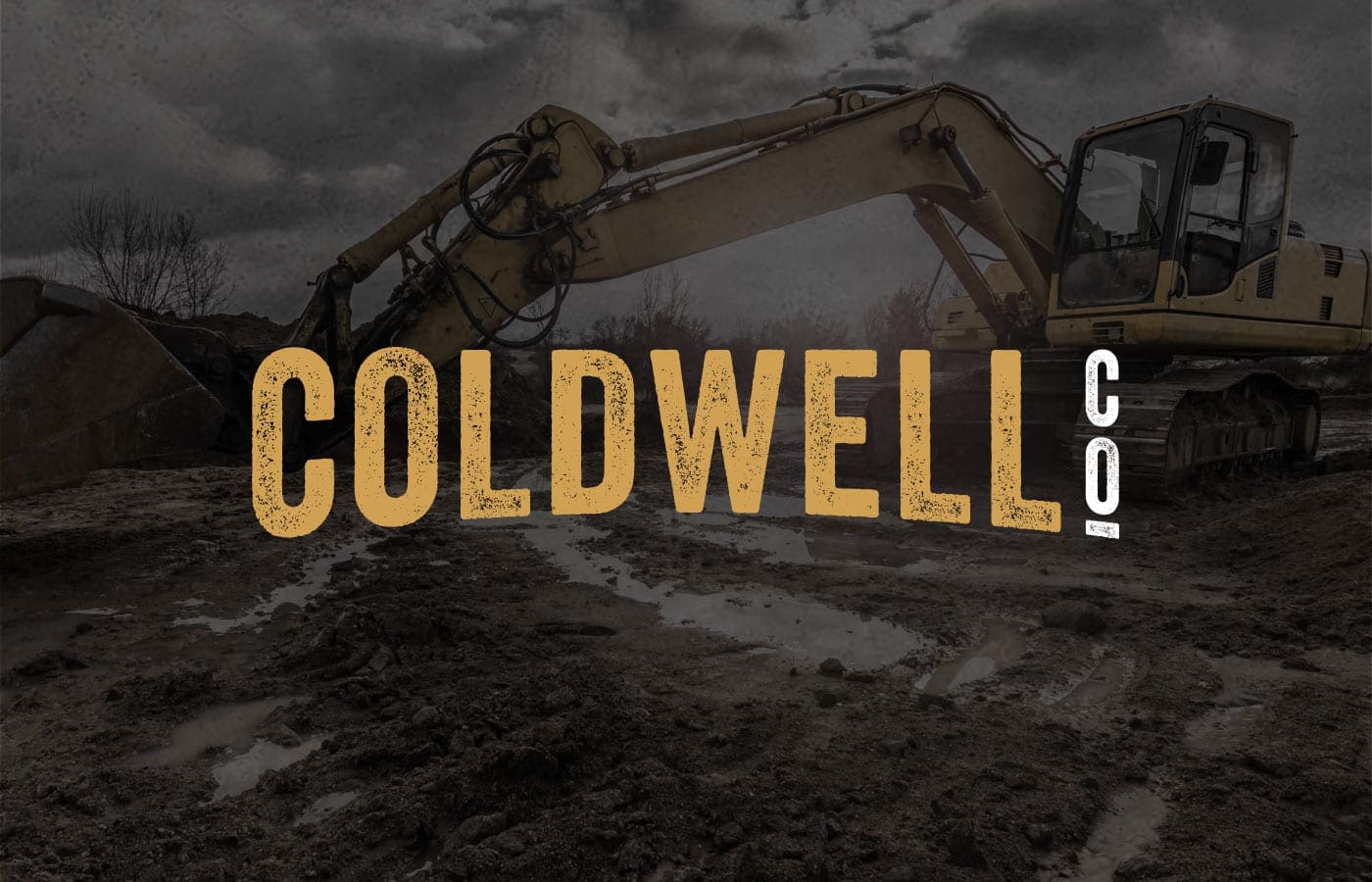
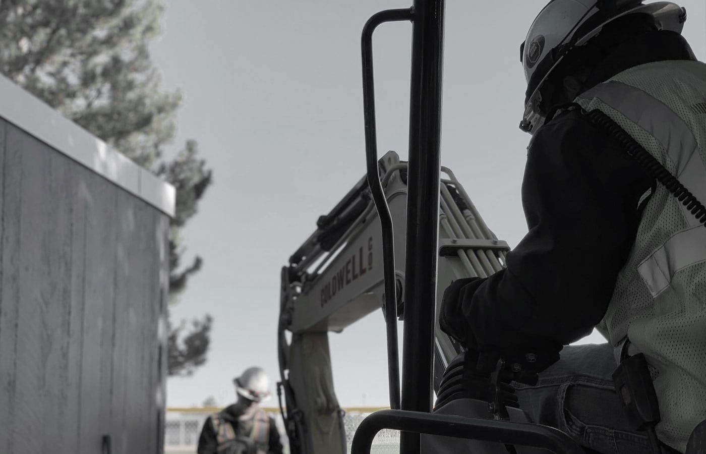
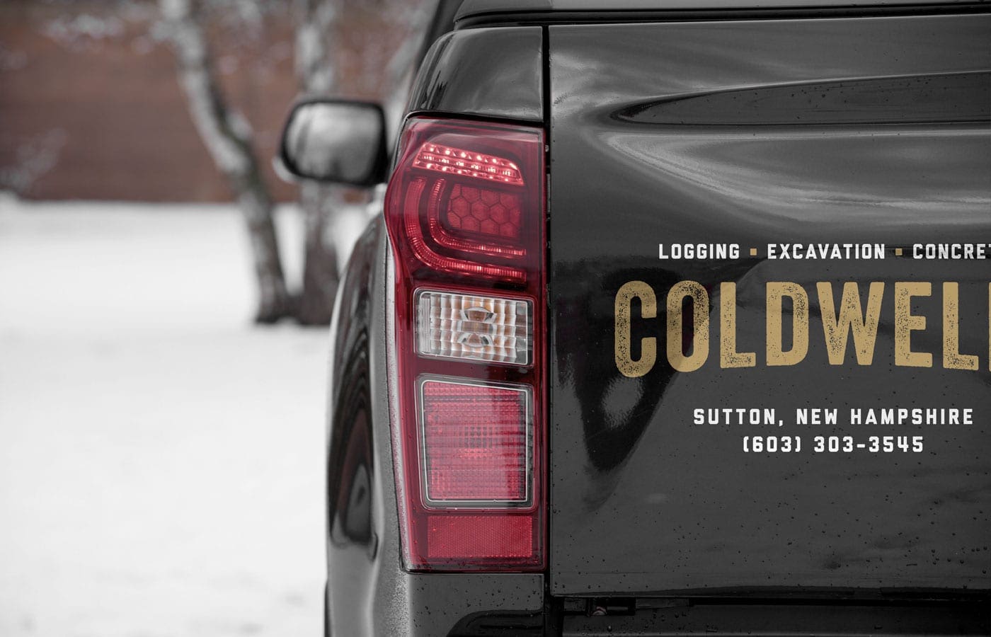
In the new logging logo design, the Coldwell company name is the main feature, written in a modern, gold, textured sans serif font. The new wordmark logo appears earthy and rugged. The gold color was derived from merging the colors commonly found within the excavation workplace – the yellow color of their equipment and brown, the color of their surroundings.
Following the company name, is a second row of copy that describes the company services: logging – excavation – concrete. These words are written in a white font so that it easy to but subtle enough that it does not outshine the company name. This set-up allows the company name to stand out but also makes the company services easily recognizable.
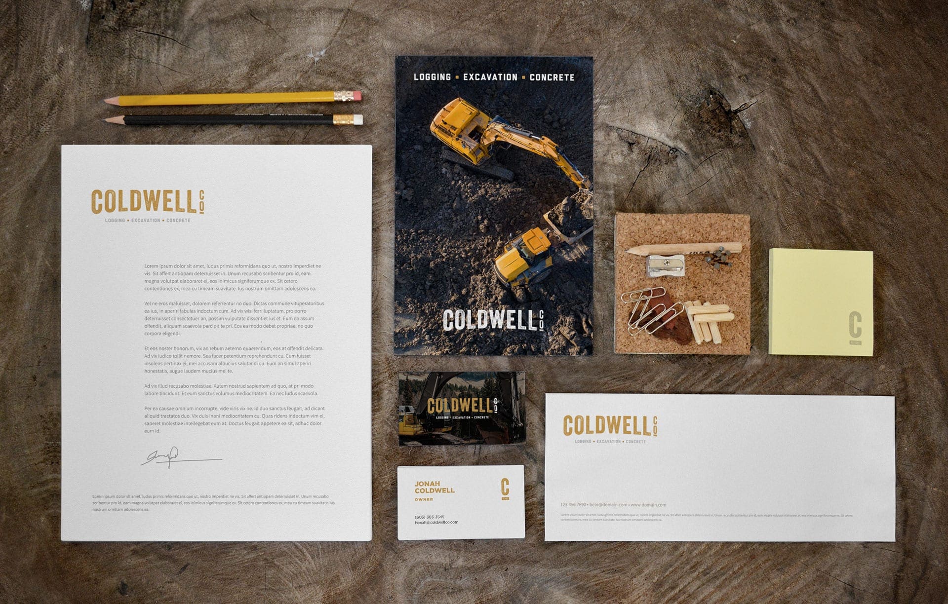
Strength and durability conveyed with a timeless design
Starting from an outdated, traditional logo design – the excavation branding process led the company to a new look that is timeless, versatile and memorable. By creating a wordmark logo, this New Hampshire company is now easily identifiable, simple to use and provides a timeless look that will push the company brand to live on for time to come.
The gold text lettering is paired with dark backgrounds, which makes the font appear to have speckles of dirt across the company name. The dark background also presents a nice contrast to make the logo stand out and easily recognizable. The logging logo design now belongs on the same stage as some of the major, national manufacturing peers.
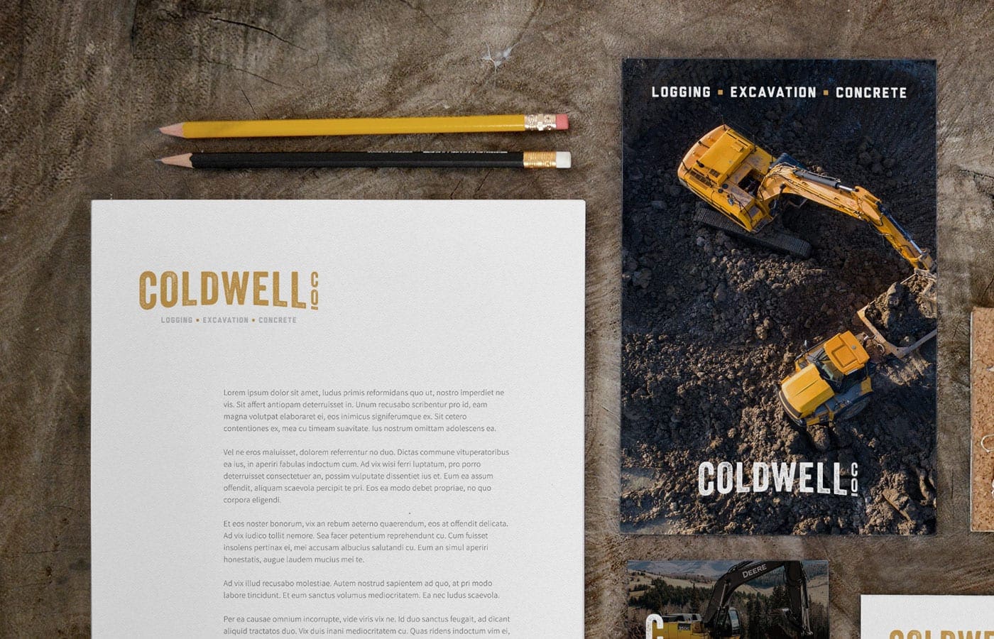
RYCO created a logo that would work well on everything from machinery and letterhead to t-shirts and packaging. Drawing from the inspiration of strength and durability of the project work, the updated look now matches the polished reputation of the company.
