Dirt Cowboy Café
A Micro-roaster Coffee Shop in Downtown Hanover, NH
The Project
A Hanover, NH Gourmet Coffee Roaster Seeks Premium Logo Design
Dirt Cowboy Café has served freshly roasted coffee to the Hanover, New Hampshire community since 1993. The café serves coffee made from 100% pure Arabica beans and ships the premium beans overnight to customers across the nation. Voted the “Best Gourmet Coffee Shop” in the region for seven consecutive years, the gourmet micro-roaster wanted a strong visual brand to connect to its patrons in the community.
Client / Dirt Cowboy Café
Industry / Food and Beverage
Location / Hanover, NH
Visit / dirtcowboycafe.com
Project Scope
The Need
Local Coffee Roaster Looks to Expand Reach with New Visual Brand
This well-known coffee shop located in Hanover, New Hampshire within walking distance of Dartmouth College had been building its reputation and customer base in the Upper Valley community for over 10 years. Through its customer-first business philosophy, the company incorporates customer feedback directly to modify its products and offerings. Adopting a recognizable visual for the brand became increasingly important as its products and brand name branched out to homes across the United States. Seeking to develop a logo design and brand identity, the owner reached out to RYCO Design. The owner was specific about the visual direction for Dirt Cowboy Café – requesting an iconic mark featuring a cowboy on horseback holding a cup of coffee.
The Journey
Bringing to Life a Local Coffee Brand with a Western Theme
RYCO Design started the process by drafting a few illustrations that represented the western brand the owner requested. The first set of logo design options closely matched the original request, with various silhouette drawings that brought to life the cowboy on top of the horse. The designs showed animation and movement, with changing frames and positions of the horse and cowboy, varying emphasis on the lasso or coffee in hand and a few changing details for the silhouette.
Additionally, RYCO Design provided a set of alternative, non-cowboy options. These included a classic coffee mug, text-only options and those combined with other cowboy accessories and vintage concepts. These were provided to spark any additional ideas and ensure the direction of the final concept. All designs were presented along with multiple typeface options, from vintage and western, to funky and modern. After reviewing all options, the owner was confident in moving forward with the western cowboy theme.
The Result
Vintage Cowboy Meets Modern Micro-Roaster
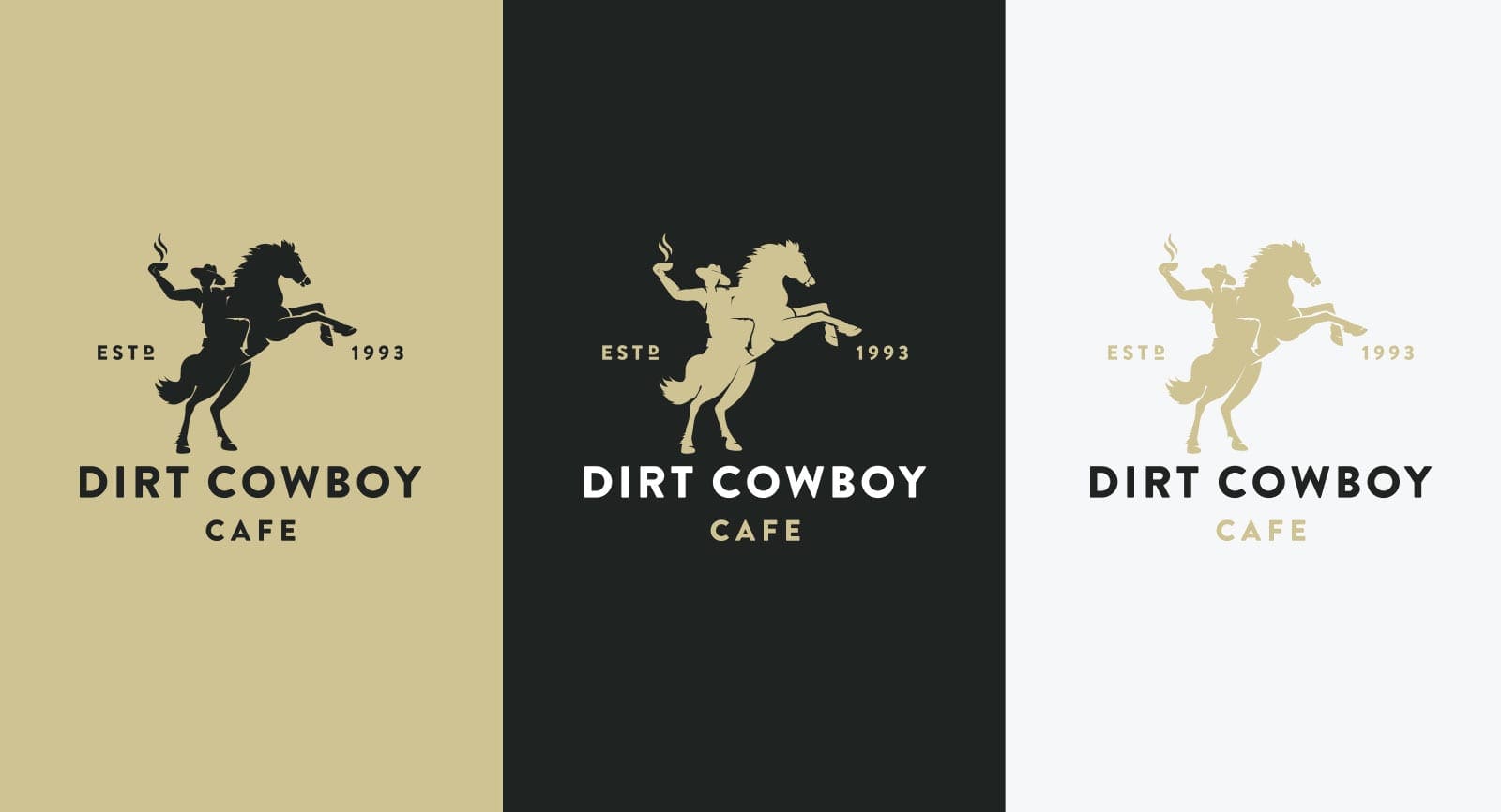
Considering the main focal point of this brand, the new color palette picked up on the black and brown color of the aromatic coffee beans and was complemented by golden colors to soften the dark theme. With just a few tweaks to the illustration of the cowboy and cup provided, RYCO Design then focused on the font placement in the design.
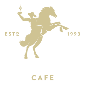
The final logo design features imagery that is western like its company name but is complemented by typography that is modern like its approach to business. Playing further into the vintage theme, RYCO Design incorporated the year the brand was established as a major component of the overall brand design. The final logo has “established 1993” planting the cowboy silhouette, anchored by the name in a semi-circular positioning.
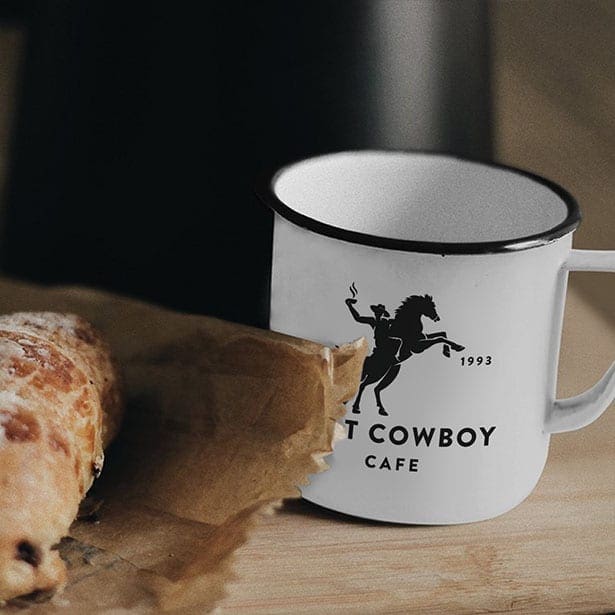
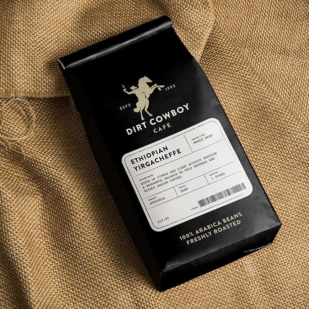
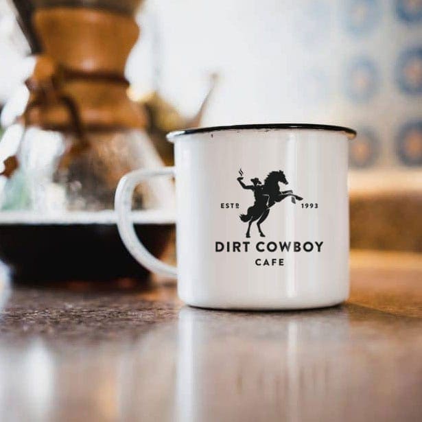
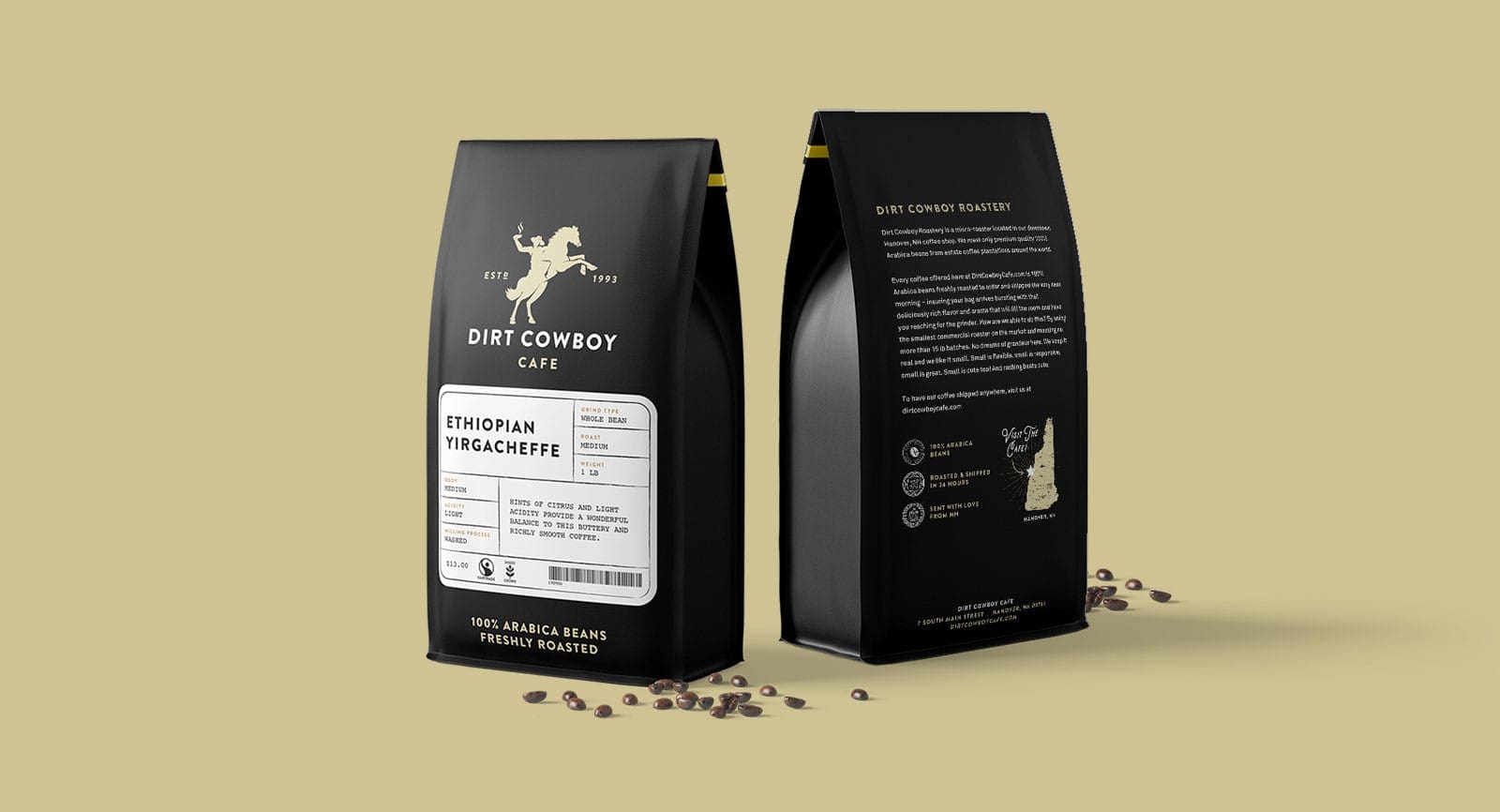
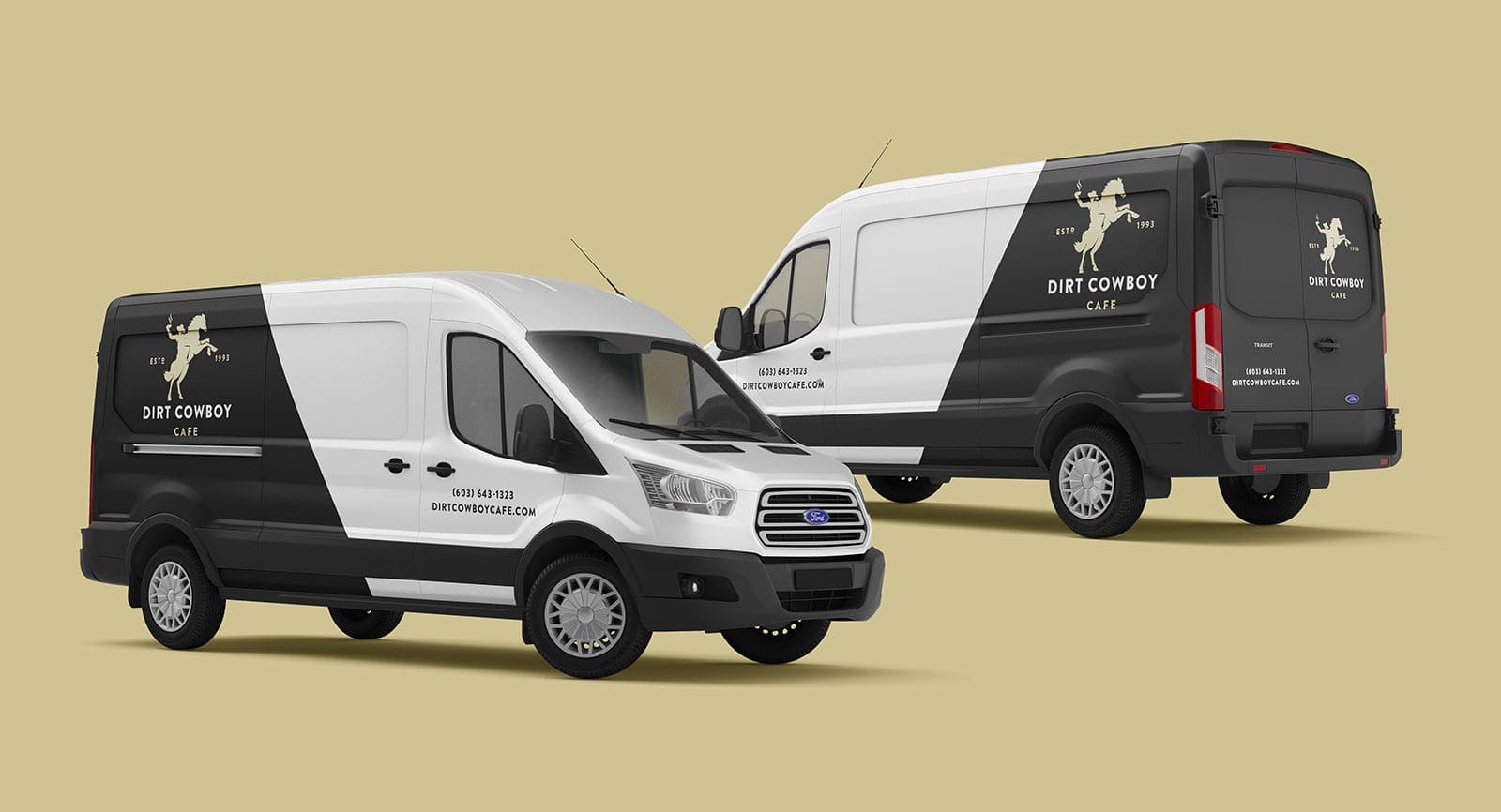
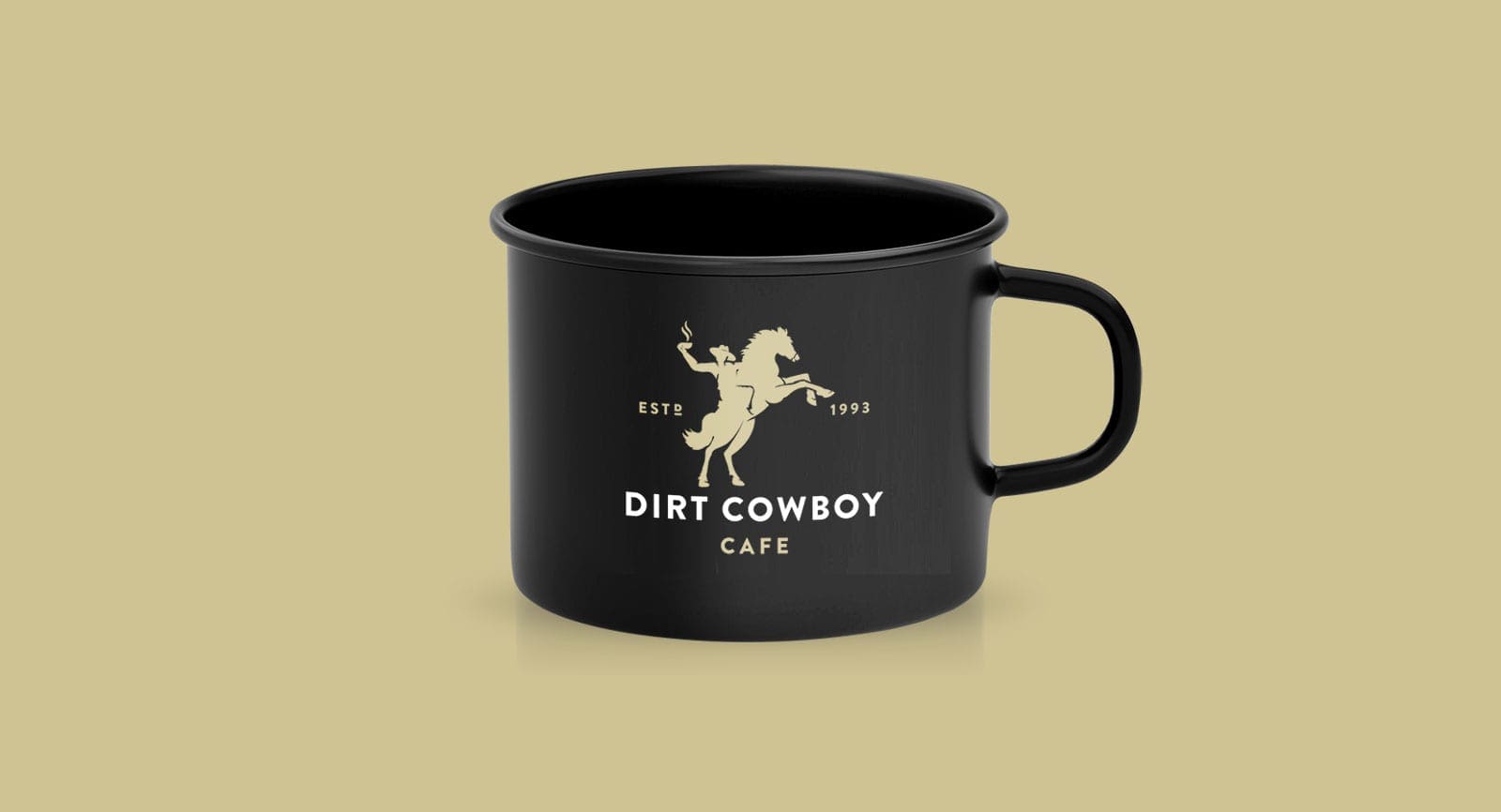
The final logo was sent over to the client with various usage options and sample placement onto an assortment of products. Once the full design was completed, the team turned to the supporting assets. RYCO Design completed the logo, coffee bag design, packaging design and print materials for the coffee roaster. With the branding now complete, the new logo is set to launch in the café and online in early-2020.
