Karner Blue Landscaping
Crafting a bold identity for a new landscaping company
The Project
A Veteran-owned landscaping brand takes flight
When Karner Blue Landscaping set out to establish itself as a premier landscaping service in New Hampshire, they needed a visual identity that was both professional and distinctive. As a veteran-owned business offering high-quality landscaping, lawn care, and snow removal, the company wanted a brand that reflected their expertise, attention to detail, and military precision. They turned to RYCO to develop a logo that would not only capture the essence of their work but also tell their unique story.
Client
Karner Blue Landscaping
Industry
Landscaping
Location
Littleton, New Hampshire
Project Scope
Logo Design
Graphic Design

The Need
A logo that balances heritage, nature, and professionalism
Karner Blue Landscaping sought a logo that would stand out in the competitive landscaping industry while resonating with their core values and regional identity. The company name itself is inspired by the Karner Blue butterfly, an endangered species known for its striking blue wings. Additionally, as a veteran-owned business, they wanted a design that subtly paid tribute to their military background. The challenge was to create a logo that seamlessly combined these elements while maintaining a clean, professional look suitable for a wide range of branding applications.
The Journey
Designing a meaningful mark
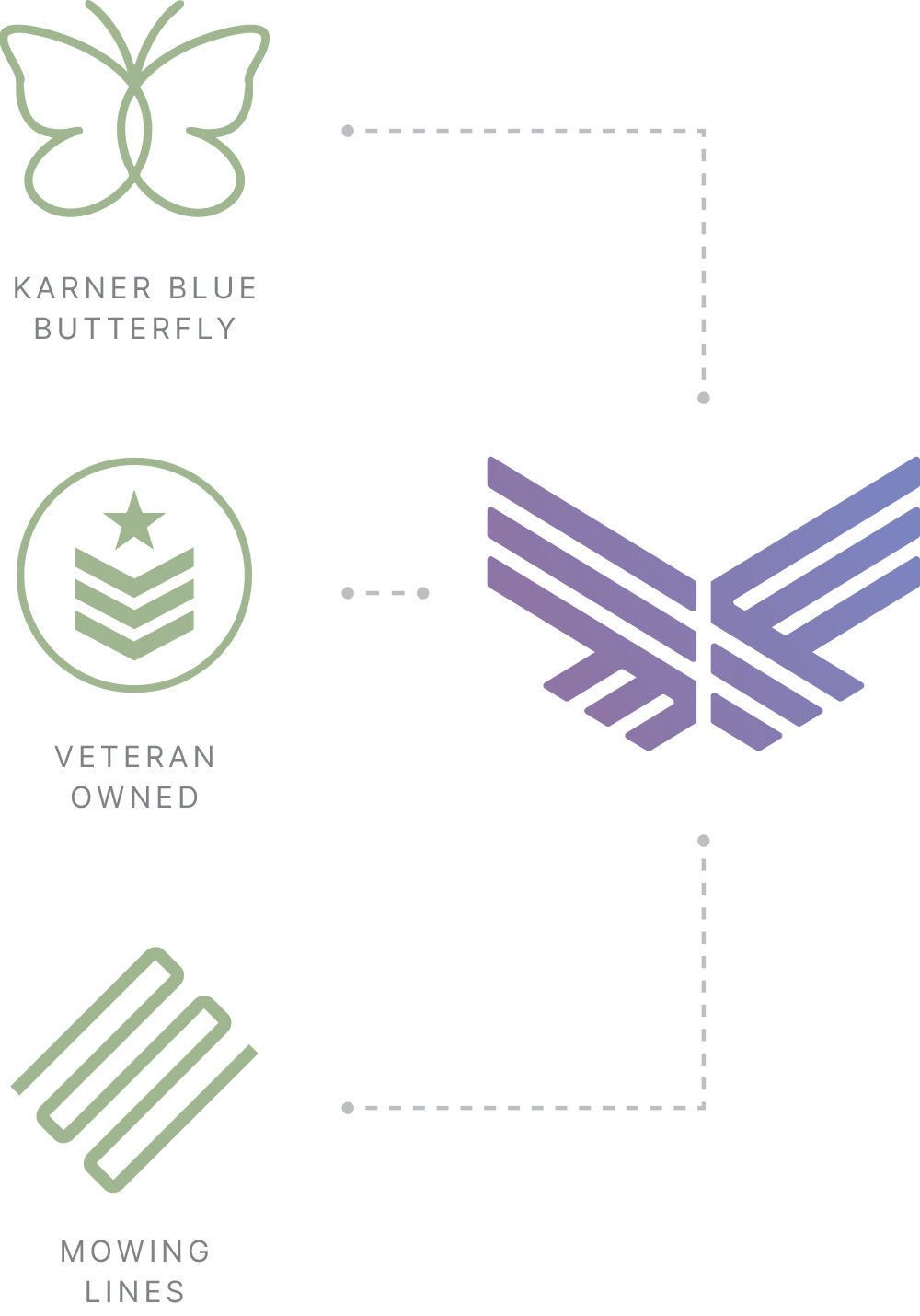
RYCO’s design process started with in-depth research and exploration of visual themes that could represent Karner Blue Landscaping’s mission. Our goal was to integrate three key influences:
The Karner Blue Butterfly: The overall shape of the logo mark was inspired by the butterfly’s delicate yet resilient form, symbolizing transformation and care for the environment.
Veteran-Owned Heritage: The linework of the logo took inspiration from the structured, disciplined aesthetics associated with military insignias, subtly nodding to the owner’s service background.
Landscaping Expertise: The lines within the logo were also designed to resemble the crisp, even mowing patterns seen on professionally maintained lawns.
To further enhance brand recognition, we carefully selected a color palette that reflected both the natural and professional aspects of the business. A rich blue-purple hue was chosen to pay homage to the Karner Blue butterfly, while a muted green reminiscent of traditional letterman jackets reinforced the company’s landscaping focus.
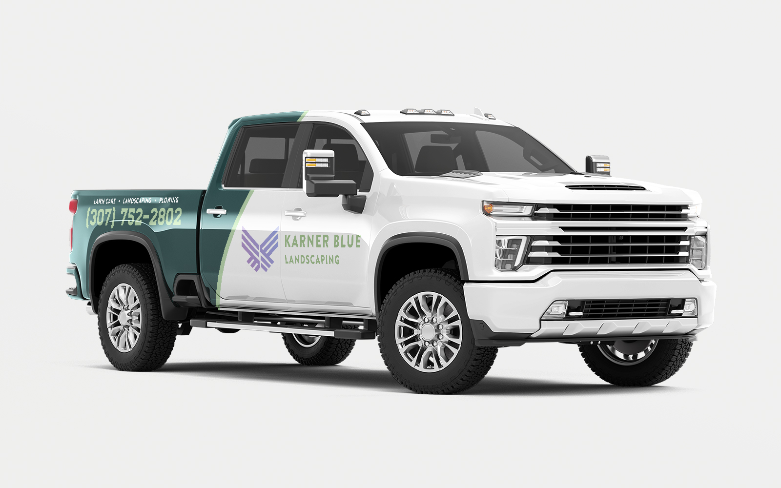
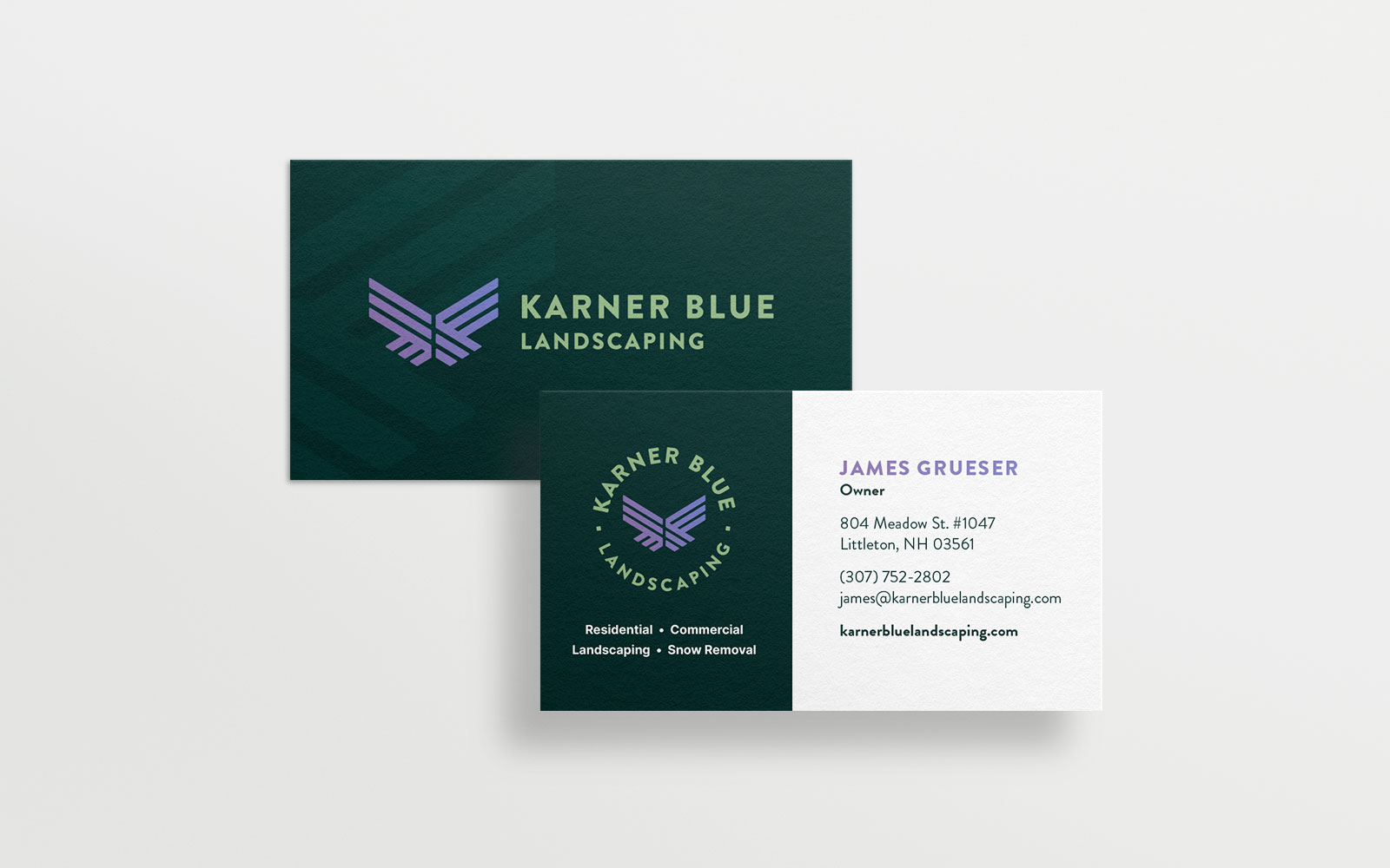
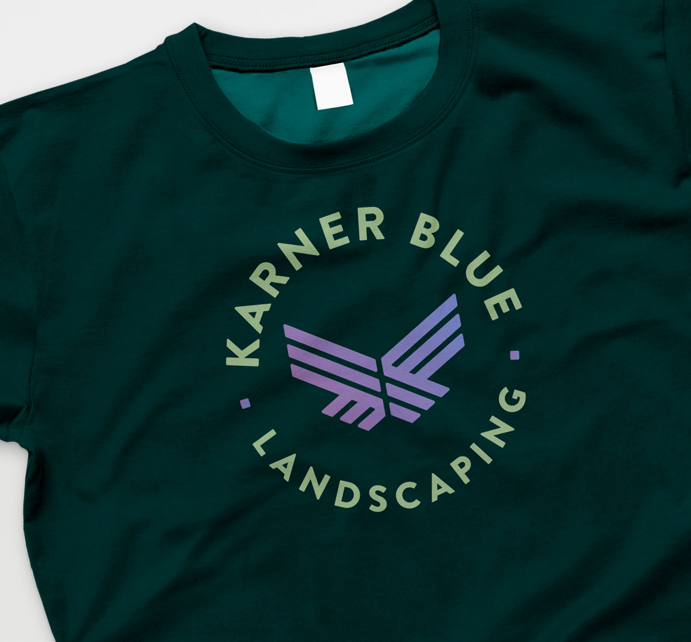
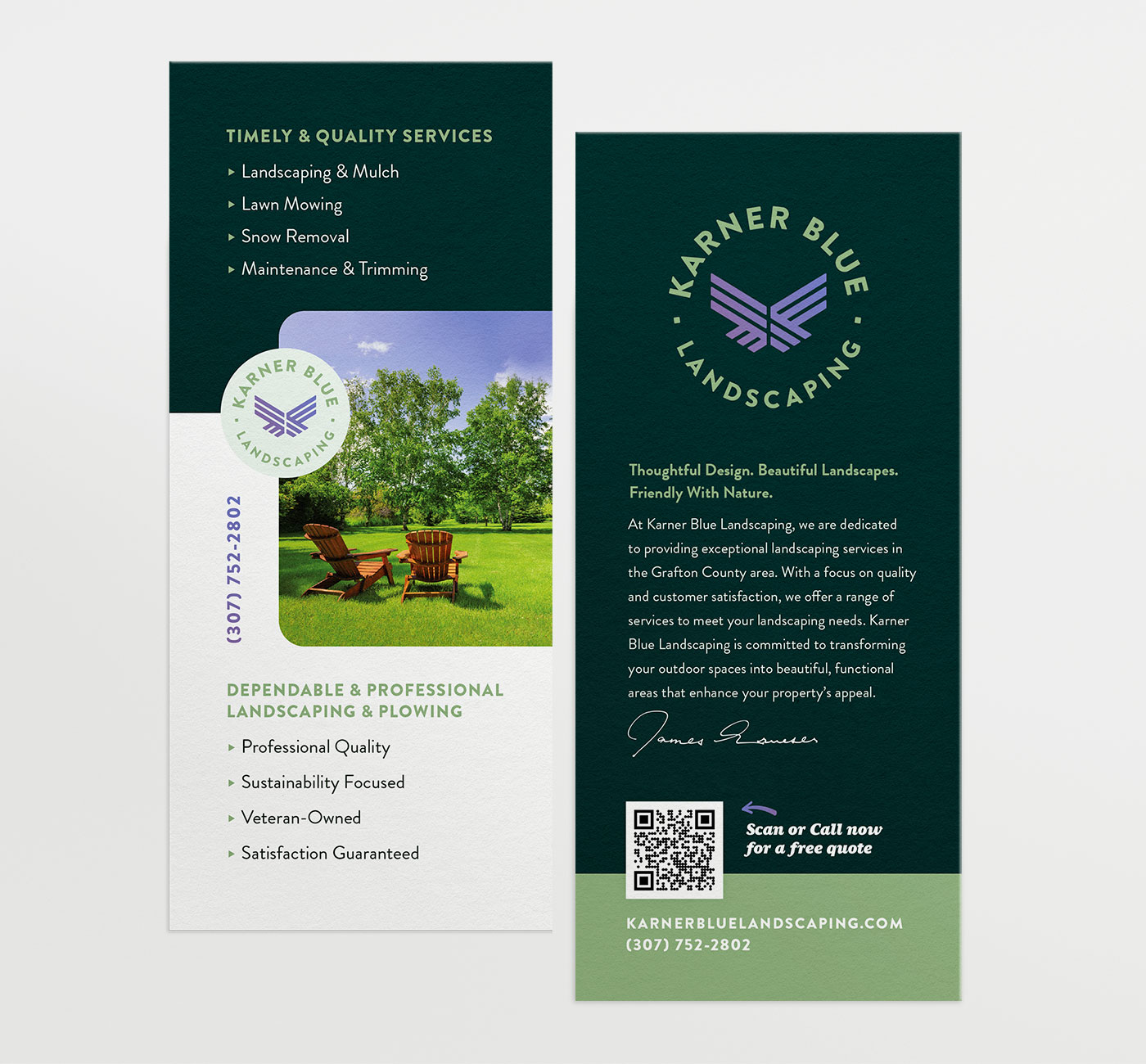
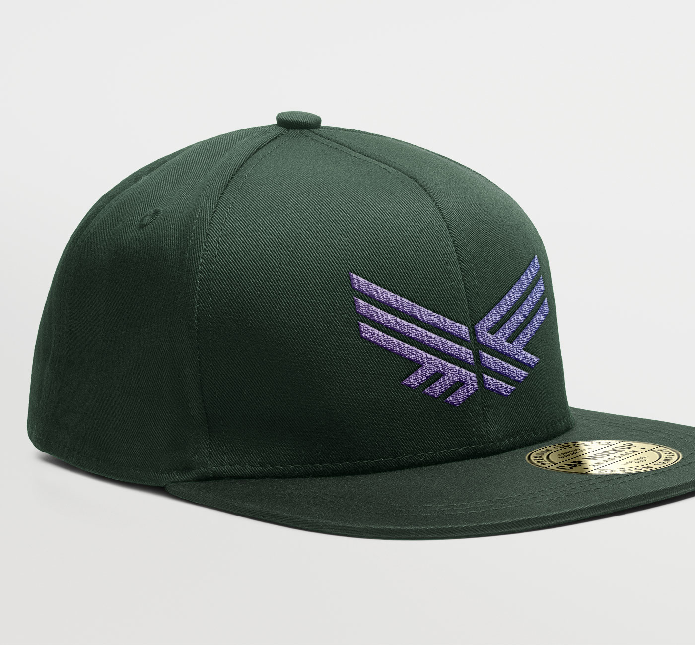
To ensure maximum versatility, we created multiple variations of the logo, including vertical, horizontal, and badge formats. This allowed for seamless application across different mediums, from business cards and vehicle wraps to uniforms and digital branding.
The Result
A professional identity ready to grow
The final logo successfully captured the essence of Karner Blue Landscaping, blending nature, military heritage, and professionalism into a cohesive and distinctive brand identity. The business now has a flexible, recognizable logo that stands out in the industry and communicates trust, expertise, and attention to detail.
With a strong visual identity in place, Karner Blue Landscaping is well-positioned to establish itself as a reliable, high-quality landscaping service in New Hampshire. RYCO’s thoughtful approach to branding has provided them with a foundation to build lasting recognition and customer loyalty in their community.